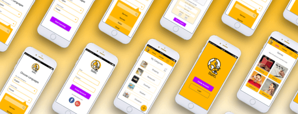
Project
Whilst undertaking a UX Design course at CareerFoundry the brief was to create an app which empowers people to learn new vocabulary. Babel was designed to help users learn vocabulary in another language for an upcoming trip abroad. The target audience is 25-35 year olds who travel regularly and want to learn the basic vocab before visiting a new country. The application is meant to be used for quick 10 minute study sessions and can be used anywhere.
Challenge
The challenge of this project was to design an app from scratch in 50 hours. Due to the time constraints I focussed on creating three features for the site which included creating a category, adding a new word to the app and a game to reinforce learning.
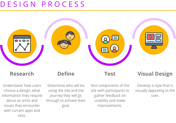
Research
Goals
- To understand the difficulties people face when learning a new language
- To gather insight into the learning styles people adopt and environments that people choose to learn a new language
- To learn what hinders people in reaching their goal of learning a new language
Interviews
To gain a qualitative insight into the approach people take to learning a new language I created a script and interviewed three people that have used a language learning app. The interviews gave me a great insight into their feelings, thoughts and behaviours around learning a new language.
Problem Statement
People learning a new language via an app need a way to be stimulated and motivated while learning because otherwise they will lose focus and quit.
Define
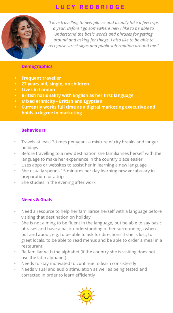
User Persona
From the interviews I defined the goals and needs of my potential users and created a user persona to represent the different audience of Babel. This persona helped me through the development of my site to test assumptions and highlight problems.
User Flow
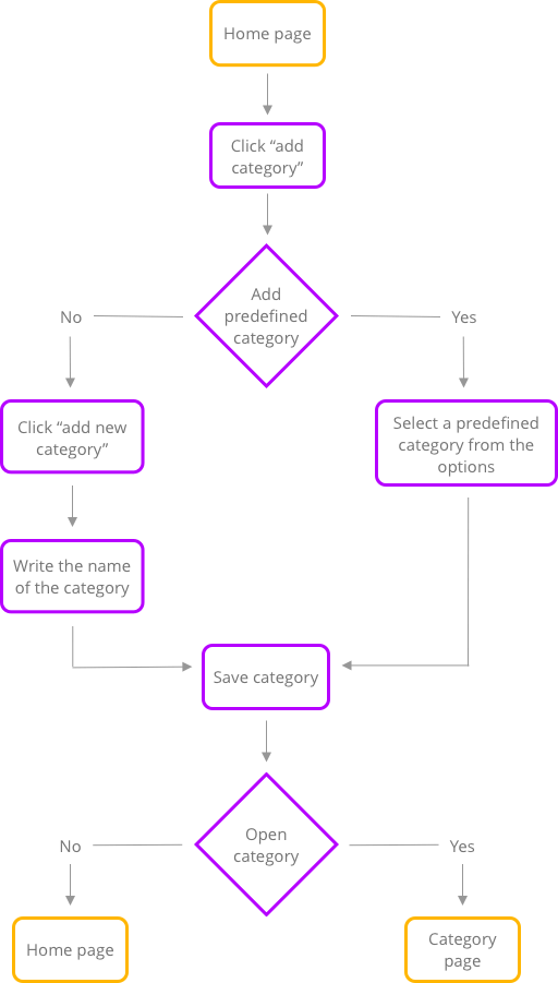
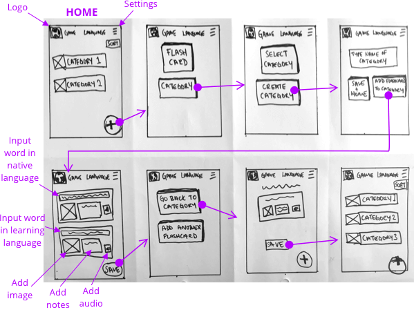
I created user flows to set out the paths that users will follow as they navigate through Babel app to learn a new language. The user flow below shows the path users will take to create a new category.
Design & Testing
Wireframes
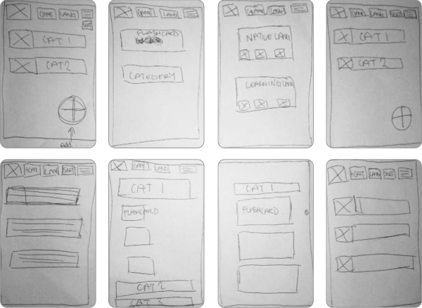
I started brainstorming ideas with the crazy 8s technique.
Prototypes
I then put together paper prototypes of the three core features. Below is an example if the paper prototype for adding a new category and word (flashcard) to the app.
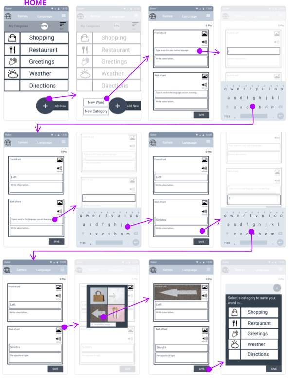
From this I created an interactive prototype using Marvel so that I could test my design with users.
Usability Testing
I carried out a moderated in-person usability test (Mobile Navigation) using Marvel. I conducted the test with three participants from my target audience, recruited through my personal network.
Test Objectives:
- Can the user create an account with the app?
- How does the user attempt to create a new category?
- Can the user create a flash card to add to the category?
- Is the user able to play a game to improve their reading?
From the user tests there was one particular issue that was identified. The participants found it difficult to navigate the “flashcard page.” They commented that there was a lot of content on the page and it was not clear where they needed to click to add their new word.
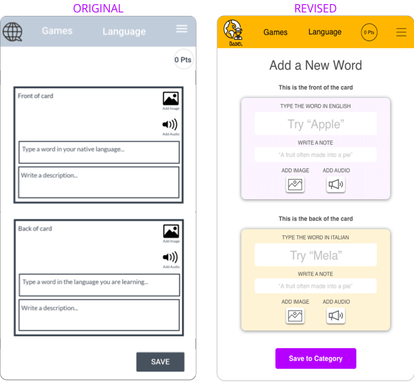
I revised the screen by firstly adding a heading to the top to remind people of the task they are carrying out. Secondly I put the instructions outside of the text boxes, so that they won’t disappear when the user starts to type. I have also given examples so that the user has more information with regards to what they should be writing in the boxes. Finally, I added a shadow to the “add image” and “add audio” buttons, to show to the user that they are able to click these buttons.
Conclusion
Three functions were created to help people learn a new language by adding a new category, adding a new word to the app and playing a game to reinforce learning. Users were able to easily navigate the game and create a new category, however the process of adding a new word needed some revision as users struggled with this task. Having re-designed this page, it would be necessary to carry out another user test to ensure that users are able to easily add a new word to their vocabulary.

