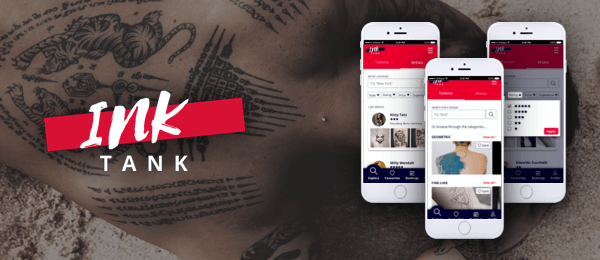
Ink Tank
Project
Whilst undertaking a UX Design course at CareerFoundry the brief was to create a responsive web app which allowed users to find inspiration for their next tattoo according to preferences like artist and style.
Ink Tank is a source of tattoo inspiration, giving design ideas to people that are thinking of getting a new tattoo and allowing them to find an artist to complete the work.
Challenge
The challenge of this project was to design a responsive web app from scratch within a six month period. Due to the time constraints I focussed on creating three features for the site which included searching for an artist and adding them to a "favourites" list, booking an appointment with an artist and sharing an image with friends.
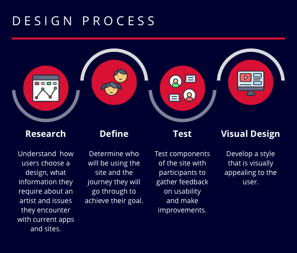
Research
Goals
- To understand how users choose a design for their next tattoo
- To determine what information users would require about an artist before booking a tattoo with them
- Documenting user pain points with existing tattoo apps and sites available
Competitor Analysis
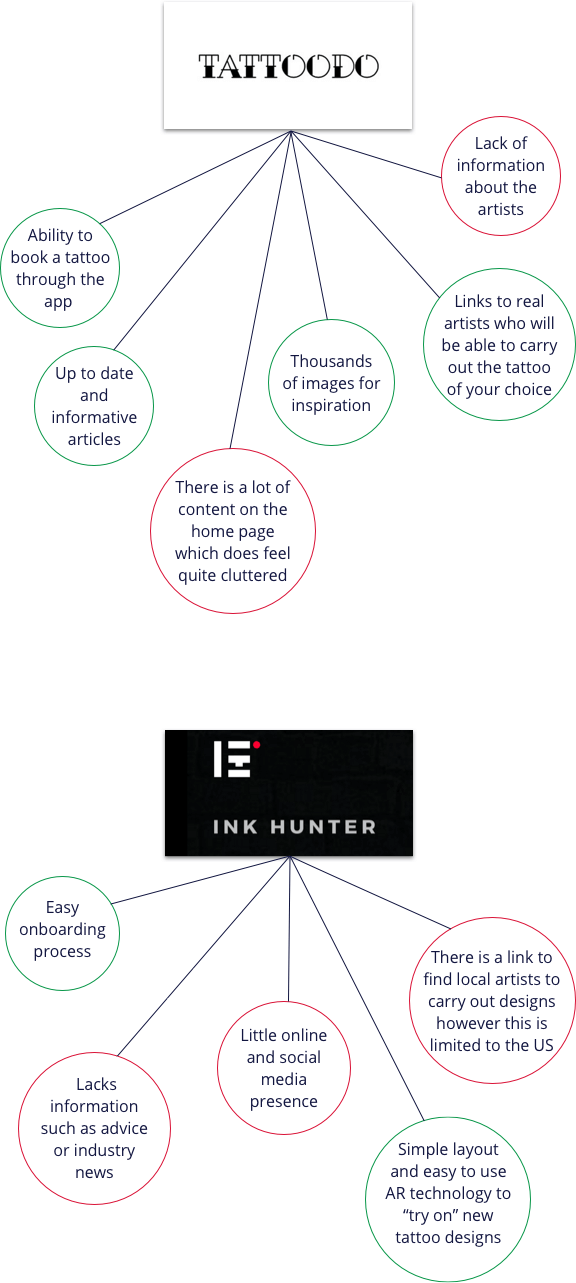
I conducted a competitor analysis to understand how current apps and sites were tackling the problem of finding tattoo inspiration and suitable artists to carry out the work, what their strengths and weaknesses were and where there was opportunity for improvement.
The competitors I identified for analysis were Tattoodo and Inkhunter. For these competitors I carried out the following:
- Competitor profile
- Marketing profile
- SWOT profile
- UX analysis
Strengths & Weaknesses
Problem Statement
People that would like to book a tattoo sitting need a way to find a tattoo artists close by that they can trust because they need to be able to travel to the studio with ease and ensure that the tattoo artist they have chosen is able to carry out their design safely and accurately.
We will know this to be true when we see how many users are filtering by location and tattoo artists ratings/reviews.
Surveys
In order to ensure that I was addressing the correct problem with my design I carried out a survey to provide me with quantitative feedback. The survey was carried out on the target audience of people over the age of 18 who are considering getting a new tattoo or have been through the process of getting a tattoo, to ensure that the results would be representative of potential users. I invited participants to take part in the study via Slack and my personal network and used Google Forms to carry out the survey.
Results
- Finding the right design and the right artist are of equal importance
- Extremely important for people to know that an artist is licensed
- People want to know the artist has good reviews from others that have used them
- Must know what style of work the artist is most proficient in
- he majority of people would not travel over 50 miles for a tattoo
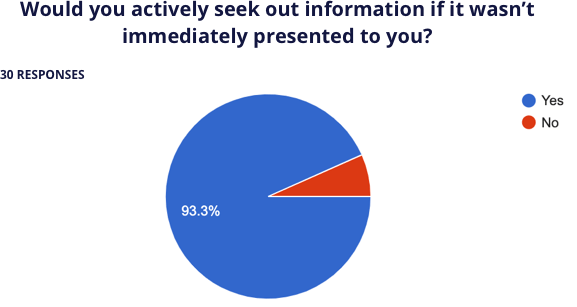
It's important that all relevant information is presented to the user so that they do not need to leave the site to find it.
Interviews
To gain a qualitative insight into people’s attitudes on the process of getting a new tattoo I created a script and interviewed three people that have been through the process of getting a tattoo. The interviews gave me confidence that I am addressing the right problem with regards to the importance people place on the information about the tattoo artist they have chosen. It was interesting to learn that, other than the information I had suggested in my initial survey, people also place an importance on how much the artist charges for their work.
Define
User Personas
From my initial research I have defined the goals and needs of my potential users and from the results created user personas to represent the different audiences of Ink Tank. These three personas helped me through the development of my site to test assumptions and highlight problems.

User Journeys
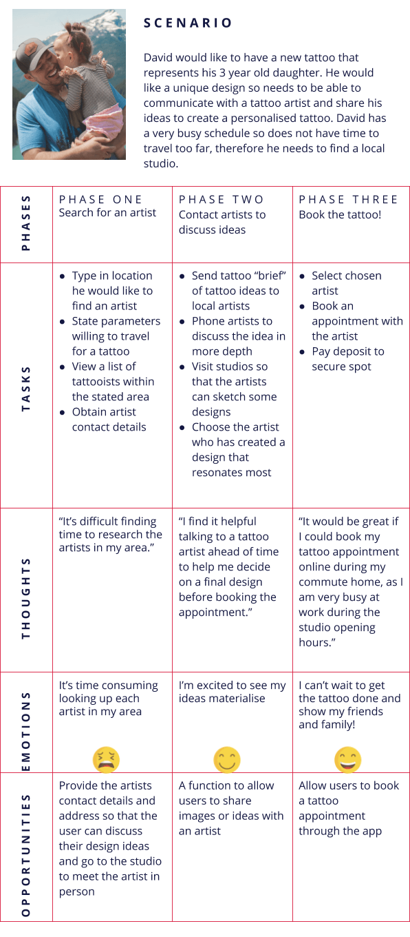
In order to visualise the process a user goes through to accomplish a goal, I created a user journey map for each of my personas. Below is an example of David's user journey.
Site Map
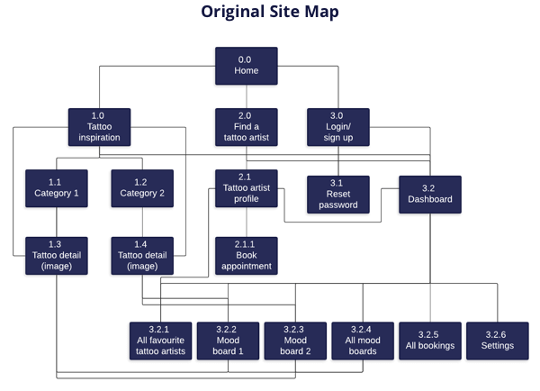
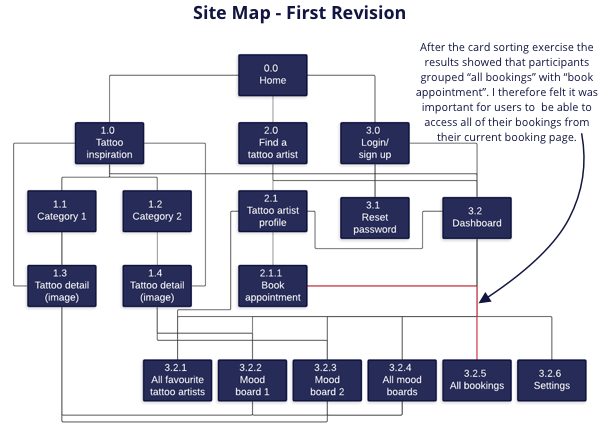
Before creating a site map I carried out a content audit on competitor site Tattoodo. This provided me with a base of the type of information required for my site, Ink Tank. Based on my research I created an initial site map.
Card Sort
After creating the initial site map I conducted a card sort to understand where my users would expect to find certain content on the Ink Tank site. I conducted the card sort using OptimalSort, with six participants sorting 30 cards.
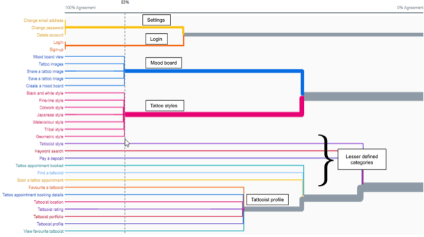
From the dendrogram below, it is clear to see that the participants noticeably defined 5 groups from the card sort - settings, login, mood board, tattoo style and tattooist profile. These groups seem to be inline with my original sitemap, however, looking further down the dendrogram there seems to be less agreement on where some items should be placed, for example finding a tattooist, booking an appointment and paying a deposit.
From the similarity matrix below (right) it seems that finding a tattooist was often grouped with “keyword search” suggesting that users will perhaps want to type in artist details, something I should consider when planning the content of my pages.
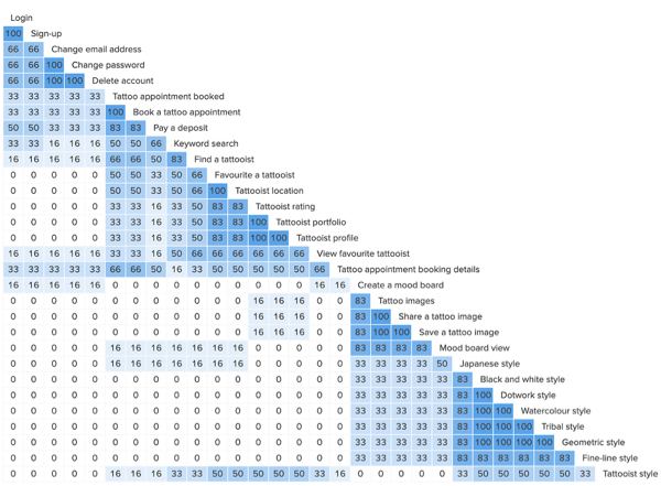
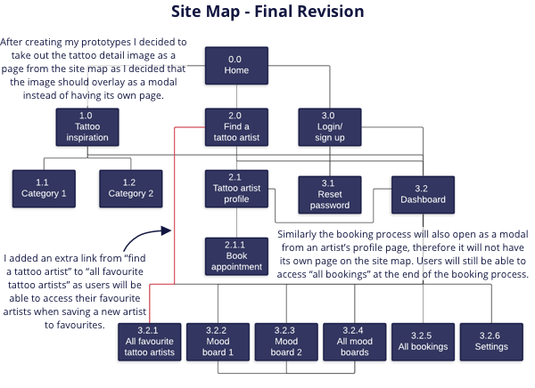
I also noticed that “booking an appointment” and “viewing appointment details” were often grouped together with “finding a tattooist”. As a result of this finding I feel that I should adjust my sitemap by linking the tattooist to the booking details page.
Design & Testing
Sketching
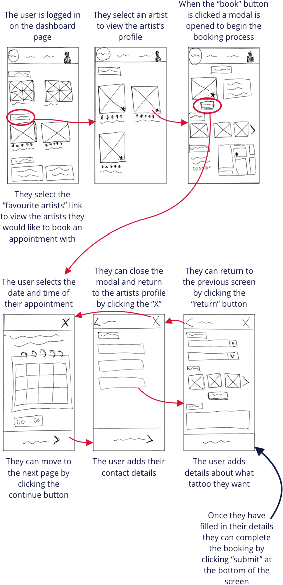
After sketching low-fidelity wireframes for various pages of the Ink Tank site I put together paper prototypes of the three core features of the site. Below is an example of the paper prototype of booking a tattoo appointment.
High-Fidelity Prototype
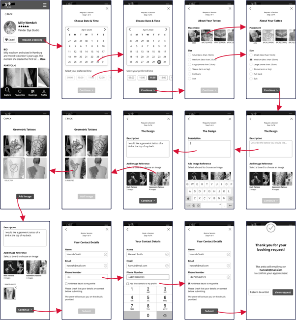
I used Sketch to create high-fidelity wireframes of the three functions of my site. I put these together to create a high-fidelity prototype that I could use for testing these functions with my target audience.
Below is an example of a high-fidelity prototype for booking a tattoo appointment. As you can see in comparison with my low-fidelity prototype I have separated the booking form into more pages so that the user isn't overwhelmed by too much information on each page. The prototype was also designed in black and white to ensure that users were not relying on colours to provide them with information.
Usability Testing
I carried out a moderated in-person usability test (Mobile Navigation) using Invision. I conducted the test with six participants from my target audience, recruited through my personal network.
Test Objectives
- Can the user find a suitable artist by setting filters?
- Is the user able to save an artist to a “favourites” list?
- How does the user attempt to book an appointment with an artist?
- Is the user able to share an image with friends?
During the test I identified the following issues...
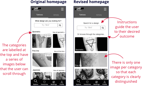
Issue 1: Two out of six participants found the homepage confusing as they didn’t find the categories clear.
Solution: Add instructions to both the search bar and the categories and have only one image to represent each category.
Issue 2: Two out of six participants had issues finding the “book session” button
Solution: Change shape and position of the button and ensure there is more white space around it
Issue 3: Two of the six participants tried to search for an artist using the search bar, rather than navigating to the “Artists” tab.
Solution: Make the tabs more prominent by highlighting them in a different colour.
Issue 4: One of the participants felt confused by the wording of the “view booking” button, as the form she had completed was a booking request.
Solution: Change the wording from “view booking” to “view booking request”.
Preference Testing
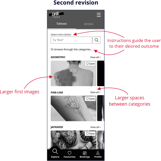
I went on to test the homepage further by carrying out a preference test on the original and the revised design of the homepage using UsabilityHub. After gather responses from 14 participants, the results showed surprisingly that 67% of people preferred the original design, particularly the ability to swipe through images. Those that preferred the revised design found that this version was clearer with less content. I therefore made further changes to the homepage, keeping the “swiping” function however using the headings from the revised prototype to give the user more instruction. I also increased the size of the first image of the category and increased the white space around the categories to create more of a differentiation between categories. The image below shows the second revision of the homepage.
Visual Design
The Ink Tank site will have a lot of imagery as one of the reasons people will visit is for inspiration for their new tattoo. In order to make the site clear and not cluttered, white space will be used to separate content. The colour palette will be simple so that attention is not drawn away from the images.

Video Demonstration
Check out the video below for a demonstration of the Ink Tank site!

