Portfolio Website Case Study
Overview
Having recently qualified as a UX designer I wanted to develop my skills further by taking a course in frontend development in order to understand the limitations of design elements and better communicate with developers when working in a team.
As I have been building a portfolio of design work over the last few months I needed a platform to showcase my work while also giving further insight into my personality for potential employers and peers in the field. As current portfolio display sites do not have many elements of personalisation, I decided to build a responsive website from scratch in order to meet these needs and develop my skills.
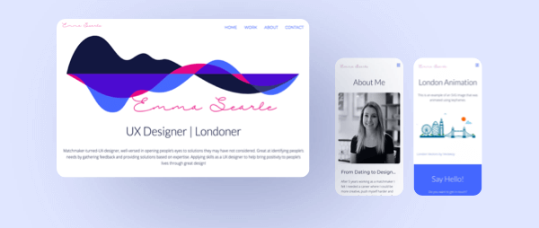
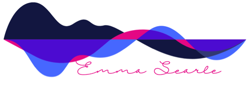
I developed a site that was clear and succinct so that it was easy to navigate. My primary colour is blue to invoke a sense of trustworthiness, yet I added a splash of pink to display a little more of my personality. Images have rounded edges to continue with the friendly, approachable nature. Text fonts were chosen on their legibility and accessibility. Colours were also adjusted from the initial selection to ensure that they met the WCAG contrast ratio guidelines.
The site is developed as a fully responsive website to ensure that the experience is smooth over each device it is viewed on. Using JavaScript, a hamburger menu was created to replace the navigation bar on mobile viewing.
There are a number of interactive elements to improve the users experience, such as text colour changes, strikethrough text and enlarging buttons when the user hovers or clicks them. There is also a fun, moving arrow animation which takes the user to project pages. These elements were created using CSS.
After usability testing, further adjustments were made to the site to ensure that it is easily accessible and each element is inline with my brand.
Context & Challenge
Background
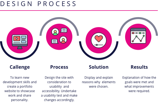
As a certified UX designer I wanted to further develop my skills by expanding my knowledge of frontend development. These skills would be useful to understand the limitations of design elements and better communicate with developers during projects. The aim was to create a responsive portfolio website to display recent projects to potential employers and peers in the design field, while building my knowledge of industry-standard systems and web development methodologies. The project was to take 8 weeks to complete.
The problem
As a recently qualified UX designer I needed a platform to display my work yet also share my personality with potential employers and peers. As current portfolio display platforms do not allow for much personalisation, developing a website to display my work would allow me to communicate my skills as a designer and developer, while also giving me the opportunity to share aspects of my personality with potential employers and peers.
Goals
- To expand on my frontend development skills and gain proficiency in HTML page structure, CSS style sheets, text editors and linters, responsive design using media queries, interaction design, & JavaScript data types, libraries and plugins.
- To create a visually appealing yet clear display of my recent projects.
- To display my skills in frontend development.
Process and Insight
Before I started building the site I made a plan of the information I needed for the site, including the content, colour scheme and typography. I then created a few wireframes to create the look and feel of the site and to try different options.
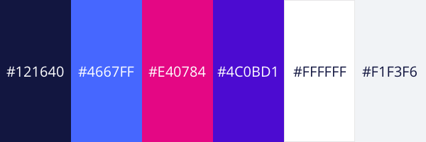
The colour palette is mostly blue as this conveys a feeling of trustworthiness. I wanted to add a splash of pink to add my personality to the site.
The following fonts were chosen because they have clear lines, are succinct and easy to read. Open Sans is the font used for the body of my text as it is accessible for all users, including those with dyslexia.
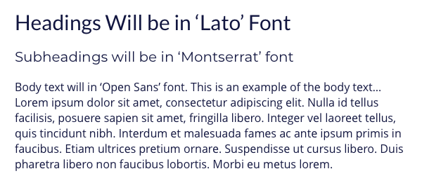
The overall feel of the site is clear and succinct. Images will have rounded edges to give a friendly feel and content is well spaced to ensure distinct sections. The site was designed from a mobile first approach, while testing the site on larger screens throughout development.
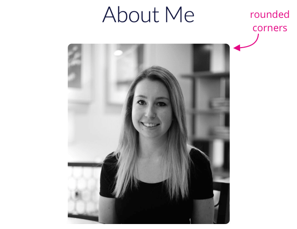
As someone new to frontend development I started with the basics in learning HTML to set the structure of my website. I then added a CSS stylesheet to bring my site to life and later added Javascript to add interactive elements to improve the user experience. In order to check my code for errors I used W3C-validation, linter-stylelint and linter-js-standard, as well as atom beautify to ensure my code was formatted correctly. When running a check on my site I realised that there was an issue with the way my images were formatted, by not having a smaller image to view on mobile and a larger image for tablet and desktop view. I therefore had to create two separate images for each view, which took a little longer than expected!
Once my code was in good shape I decided to undertake a user test on my site, to ensure that there were no issues navigating through the content. From the tests I felt that I needed to add a “home” tab rather than assuming users would navigate home using the logo in the top left corner. I also changed the downloadable CV to be more on-brand with the site. A few of the participants mentioned that if there were more projects to view, it may be too much to display them all on the homepage as this would require a lot of scrolling. In the future, once I have built my portfolio up further, I will consider having a separate page for all projects and only display the top five on the homepage.
Solution
Homepage
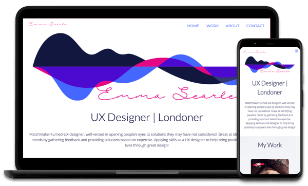
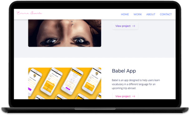
The homepage has the distinct “drip” logo running across the top of the page, with the signature writing of my name underneath. This is to keep in line with my personal brand, as this logo can be viewed on my other social media sites. The logo also injects a little more personality to the site and introduces the pink colour.
The projects are displayed in rows, with a subtle change in background colour for each project, to make it clear that they are distinct. A short description accompanies each project to give the viewer an insight into the work carried out, and there is a button to take the user to the full project details.
About Page
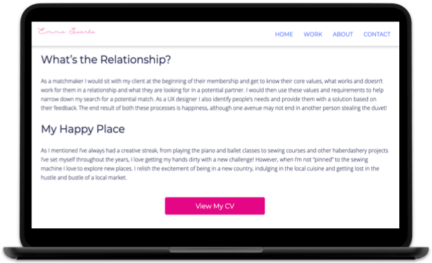
The about page is the place where the user can really get to know me! There is an image of me at the top in order to add a little more personalisation to the site and a description of my background underneath. I have added a link to my CV on this page so that potential employers have easy access to my past experience. There is also a list of my skills so that the viewer can easily identify my capabilities. Rather than adding another list of the tools I have used, I added an image of these to break up the amount of text on the page.
Project Pages
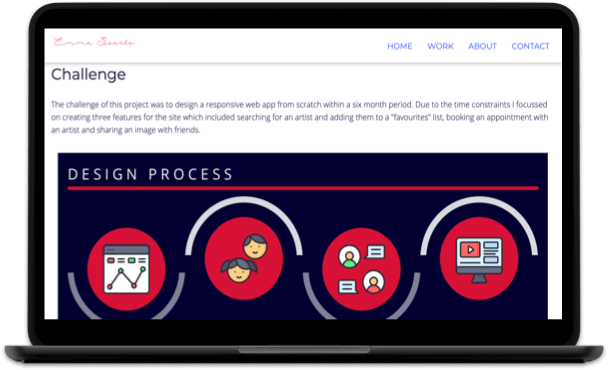
The project pages each follow the same format to ensure that there is consistency when navigating the site. For each project there is a description of the process and image examples of the work to keep the viewer’s interest.
Contact Section
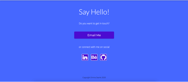
At the bottom of each page is a contact section so that viewers can reach out to me via email or connect with me on LinkedIn, Github or Behance. I decided to add a link to the contact section in the navigation bar so that viewers always have easy access to contact information.
Navigation Bar
At the top of the screen is a navigation bar to direct viewers to the homepage, work, about and contact information. The logo in the top left corner also links to the homepage. This information is clearly presented on a white background to ensure that users can see the information clearly. I also decided to make the navigation bar sticky, so that it follows the viewer down the screen. This ensures the user always has access to the different areas of the site and minimises the time they spend navigating to each page.
Responsive
The site was designed mobile first however it can easily be viewed on all devices. Smaller images are linked to mobile viewing to ensure that the viewer does not have to wait for the display of unnecessarily large images. Images on mobile have been adjusted slightly to those viewed on larger screens to ensure that all content is viewed clearly and annotations are readable, for example in the case of diagrams.
On the homepage, the project work is displayed with image over text on mobile view and image beside text on larger screens. This is to ensure the space on the page is used correctly.
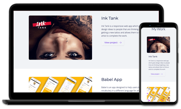
On mobile sites the navigation bar is condensed into a hamburger where users can then click to see the navigation options. A hamburger menu was chosen as this is widely recognised by most people. This adaptation was created using JavasScript.
Interactive
A number of interactive elements have been added to the site to improve the user experience. When the viewer hovers over a link in the navigation bar the link turns from blue to pink and a strike through line moves from one side of the word to the other. This highlights to the user that they have hovered over a link.
In the contact section of the page, when the user hovers or clicks on a button the button enlarges. Again this makes it visually clear to the viewer that they have hovered or clicked a button. It also makes details of the button more visible to the user.
On the homepage, if the user wants to view a project they can click the “view project” button. The “view project” button is displayed in a secondary colour and has a moving arrow next to the text. The aim of the moving arrow is to draw the user’s attention to this button and entice them into viewing the project.
These interactions were all created using CSS animations.
The navigation is visible at the top of the page at all times, however when the viewer starts to scroll down the page a shadow appears underneath the bar in order to make it more prominent. This interaction was created using JavaScript.
Take a look at the video below to see the interactive elements in action!
Accessible
Open Sans font was used for the body text as this font is accessible to all users, including those with dyslexia.
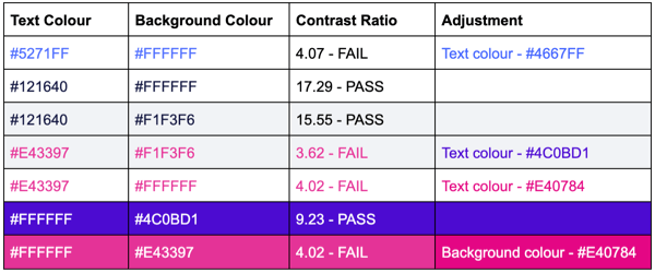
Each text and background colour have been tested to ensure they reach the WCAG AA required ratio. I had to make some changes to my initial colour palette to ensure that these standards were met. Please see the table below for the changes made.
On each image is descriptive alt text to ensure that those using a screen reader are able to understand the context of the images. If an image is unavailable the alt text will also help viewers to understand what image should have been in place.
Results
- I have successfully created a responsive portfolio site using HTML, CSS and JavaScript. Code was checked for errors using linters and adjusted accordingly.
- From user testing my site the feedback gathered suggested that my site was visually appealing yet easy to navigate. Usability issues that arose during testing were amended for a more positive user experience.
- My frontend development skills are displayed throughout the site.

